Bring Buckner into the future of brand management.


Buckner Brand Management consists of passionate people helping businesses thrive. They provide exceptional supply chain management solutions with a focus on personalised procurement and branded communications services. Put simply. They make good things happen. Buckner’s success is built off of an innovative culture, daring vision and a dedicated team who believe in a shared future. However, they felt that their brand was visually outdated and didn’t align with their tech-savvy, future-oriented mindset. Our challenge was to modernise their visual identity to reflect who they are today.
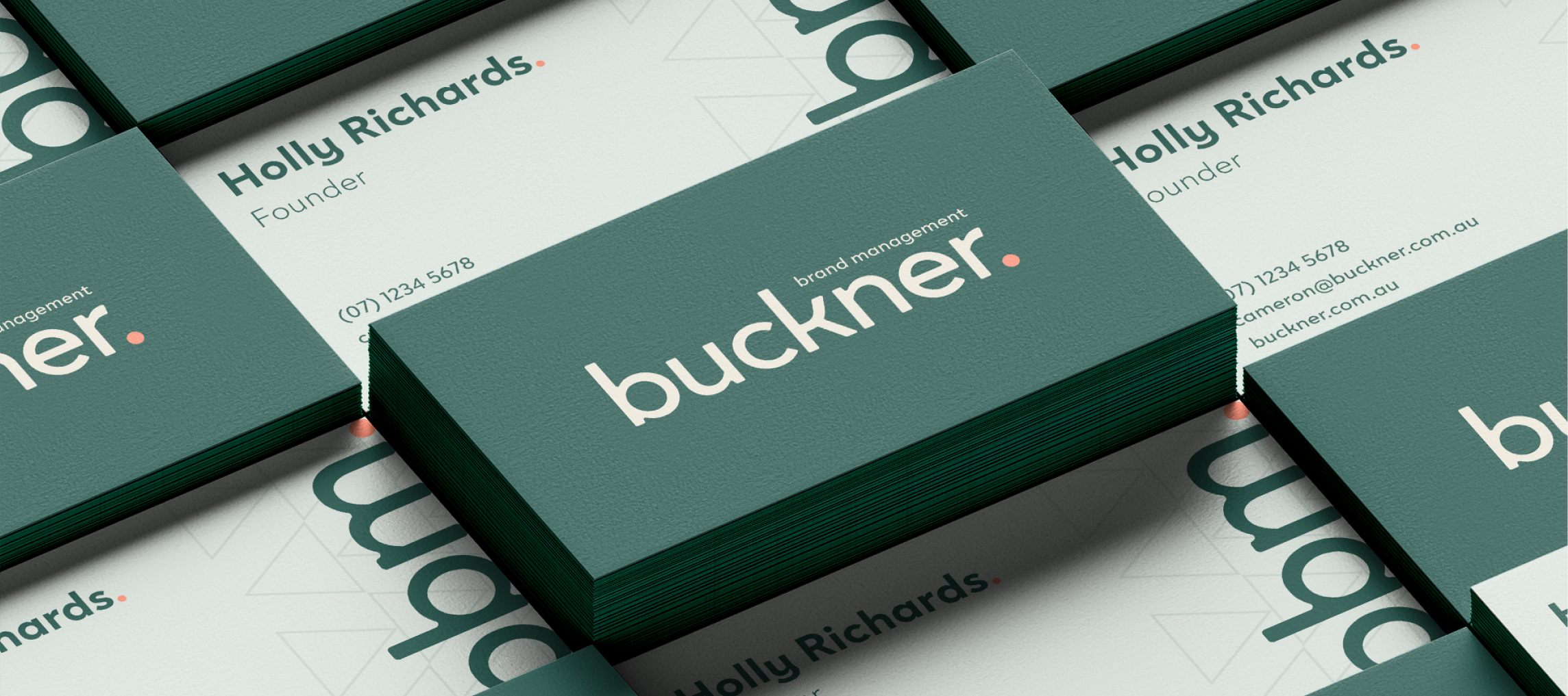
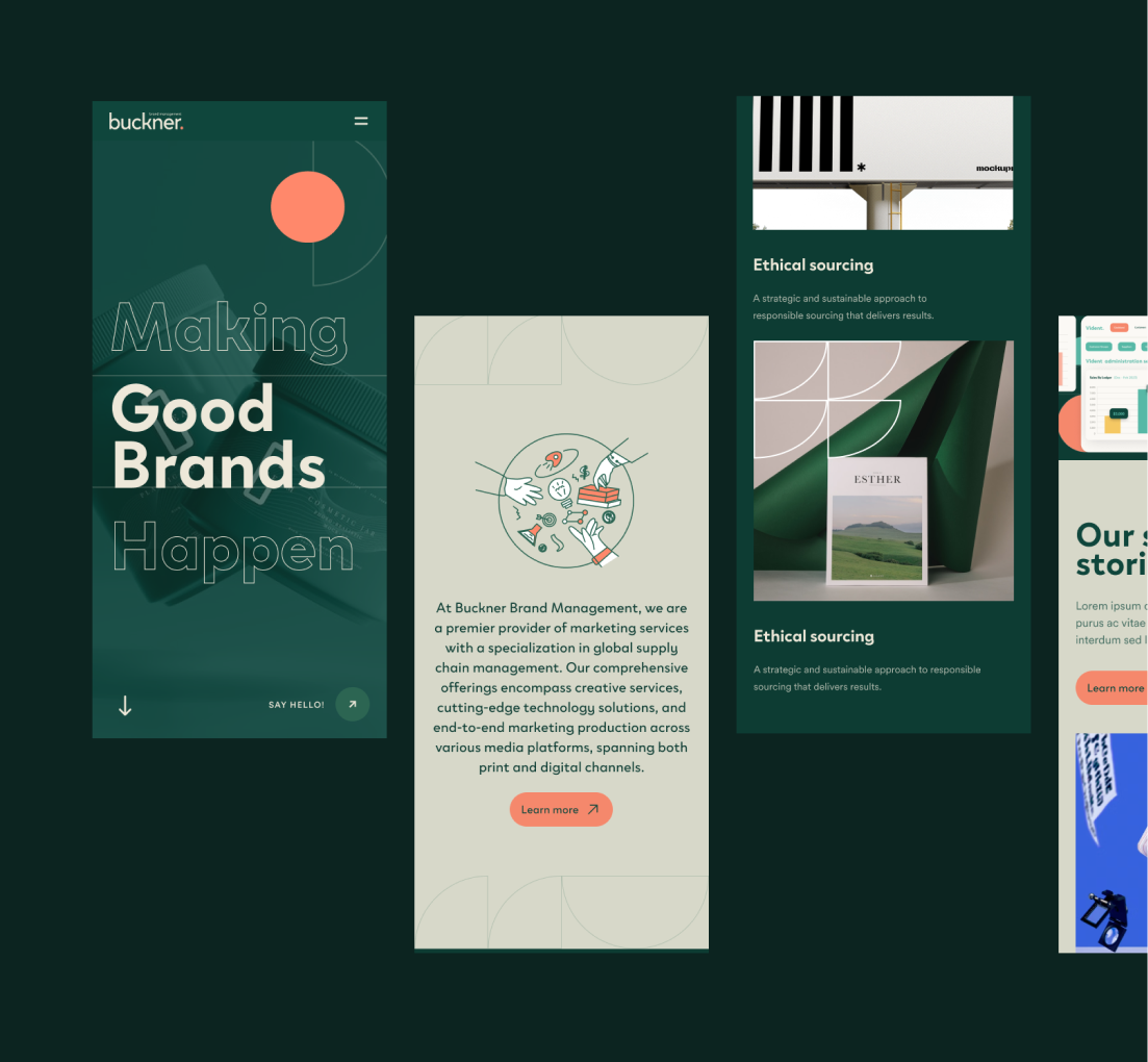
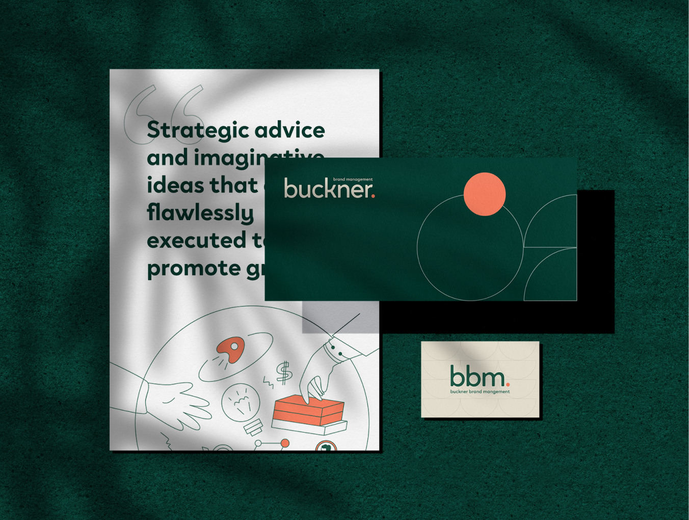
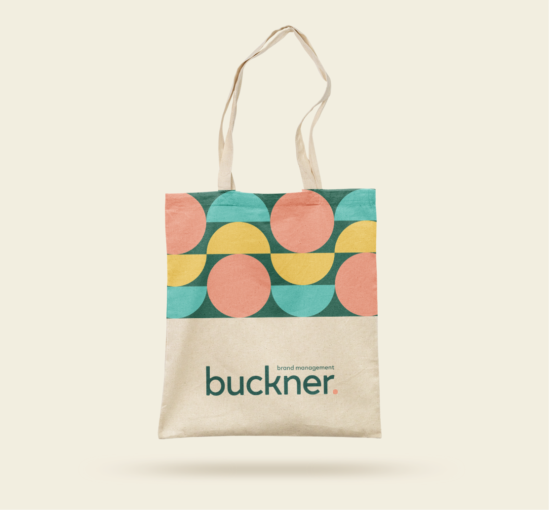
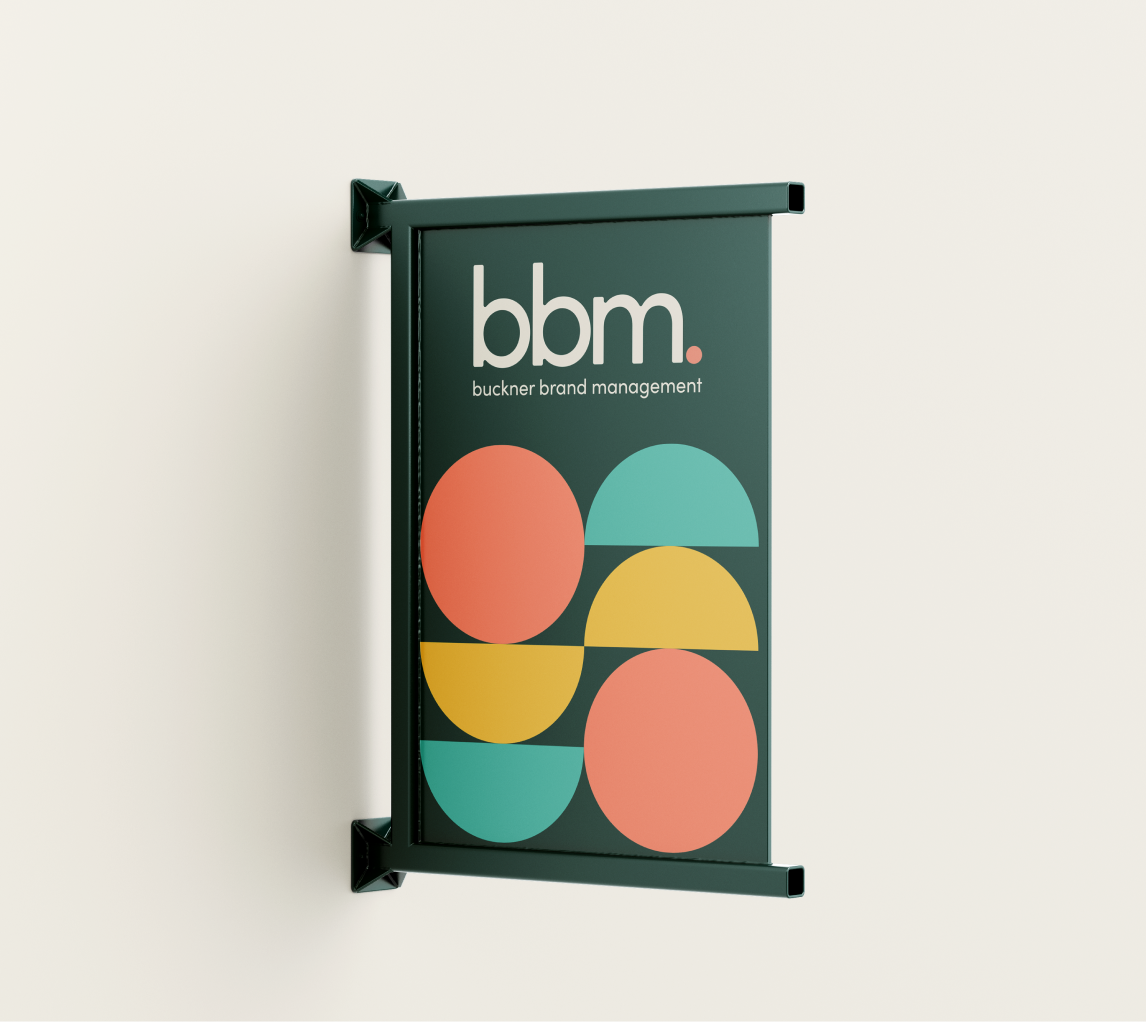
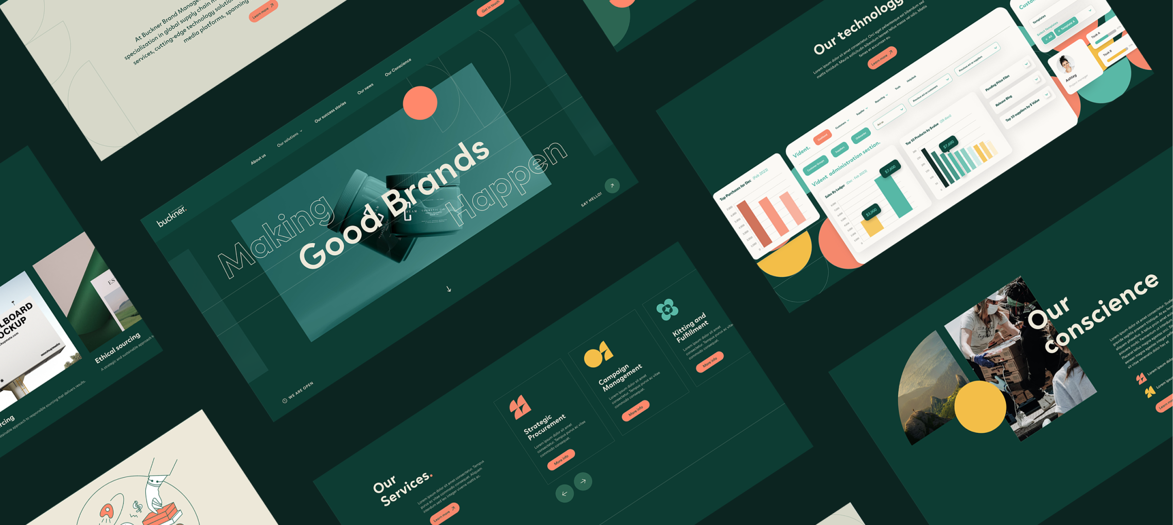
To stand out in their industry as a future-oriented brand, while paying homage to their 97 year heritage, we designed a new visual brand identity for Buckner that blended professionalism and personality. A forest green colour – symbolising growth and new beginnings – replaced the cool blue colour, synonymous with corporate businesses throughout their brand design. The new warmth and depth brought by the colour palette is complemented with a modern typeface that communicates professionalism while still feeling friendly and inviting with its daring curves. The bright, bold and clean photography style creates contrast with Buckner’s new brand colours throughout their website design, as well as their collateral. The brand language also utilises the full stop from Buckner’s logo which is repurposed and reimagined in a symbol library to create consistency throughout the brand. Finally, the brand utilises a suite of illustrations. These illustrations align with Buckner’s customer-first commitment while also injecting some personality and fun into the brand.